

Mobile devices now drive over 82% of web traffic, yet mobile conversion rates still lag behind desktop. This gap represents both a challenge and an opportunity. Businesses that crack the code on mobile landing page optimization capture a larger share of the market’s dominant traffic source, while competitors continue losing potential customers to friction and poor mobile experiences.
The median landing page conversion rate sits at 6.6%, but top performers achieve rates above 12%. The difference isn’t luck—it’s strategy. This guide breaks down the specific elements that transform mobile landing pages from traffic sinks into conversion engines.
Why Mobile Landing Pages Require Special Attention
A landing page designed for desktop and simply shrunk to fit a mobile screen will underperform. Mobile visitors have different contexts, constraints, and expectations than desktop users.
Mobile sessions are typically shorter. Someone scrolling on their phone during a lunch break has less patience than someone researching at their desk. Your page needs to communicate value and enable action quickly.
Mobile screens are smaller. Every element must earn its place. Clutter that’s merely distracting on desktop becomes actively obstructive on mobile.
Mobile connections can be slower. A page that loads in 2 seconds on office WiFi might take 6 seconds on a spotty cellular connection. Those extra seconds cost you conversions.
Mobile input is harder. Typing on a touchscreen keyboard is slower and more error-prone than using a physical keyboard. Forms that feel manageable on desktop become burdensome on mobile.
Understanding these differences is the foundation of mobile optimization. Every decision you make should account for the realities of how people actually use their phones.
Speed: The Non-Negotiable Foundation
Page speed is the single most important factor in mobile landing page performance. Research consistently shows that 53% of mobile visitors abandon pages that take longer than 3 seconds to load. Each additional second of load time can reduce conversions by 7% or more.
Measuring Current Performance
Before optimizing, establish your baseline. Google’s PageSpeed Insights provides both your current speed metrics and specific recommendations for improvement. Pay particular attention to Largest Contentful Paint (LCP), which measures how quickly your main content appears, and First Input Delay (FID), which measures how quickly your page responds to user interaction.
Image Optimization
Images are typically the largest files on landing pages and the biggest opportunity for speed improvement. Compress all images using tools like TinyPNG or ImageOptim. Convert to modern formats like WebP, which offer better compression than JPEG or PNG. Implement lazy loading so images below the fold don’t delay initial page rendering.
Consider whether you need every image on the page. A hero image that dominates desktop designs might be unnecessary on mobile, where screen real estate is precious. Sometimes removing an image entirely is better than optimizing it.
Code Efficiency
Minify CSS and JavaScript to reduce file sizes. Defer non-critical JavaScript so it doesn’t block rendering. Eliminate render-blocking resources that prevent the browser from displaying content until they load.
If you’re using a landing page builder, choose one that generates clean, efficient code. Some platforms add significant bloat that slows pages considerably.
Mobile-First Design Principles
Designing mobile-first means starting with the mobile experience and expanding to larger screens, rather than the reverse. This approach forces you to prioritize ruthlessly, ensuring your most important elements work on the smallest screens.
Visual Hierarchy
On a mobile screen, users see only a fraction of your page at any moment. The most critical elements must appear above the fold—visible without scrolling. This typically includes your headline, a clear value proposition, and either your primary call to action or a strong visual that compels continued scrolling.
Use size, color, and spacing to guide attention. Your headline should be the most prominent text. Your call to action button should stand out clearly from surrounding elements. White space between sections helps users process information without feeling overwhelmed.
Thumb-Friendly Interaction
Most mobile users navigate with one hand, using their thumb to scroll and tap. Design your interactive elements for thumb access. The bottom center of the screen is the easiest area to reach, while the top corners require stretching or repositioning the phone.
Make tap targets large enough—at least 44 pixels square—and space them far enough apart that users don’t accidentally tap the wrong element. Nothing frustrates mobile users faster than repeatedly hitting the wrong button.
Typography for Small Screens
Body text should be at least 16 pixels to ensure readability without zooming. Line lengths should stay under about 60 characters to prevent eyes from getting lost moving between lines. Line height (spacing between lines) should be generous—around 1.5x the font size—to improve readability.
Avoid light gray text on white backgrounds, which may look elegant on large screens but becomes difficult to read on phones, especially in bright outdoor light.
Single-Column Layouts
Multi-column layouts that work on desktop become problematic on mobile. Columns either become too narrow to read or require horizontal scrolling, which mobile users hate. Convert to single-column layouts that stack vertically and scroll naturally.
Crafting Headlines That Convert
Your headline is often the difference between engagement and bounce. On mobile, you have mere seconds to convince someone to stay.
Clarity Over Cleverness
Clever headlines that work in magazine ads often fail on landing pages because they require too much interpretation. On mobile, where attention spans are even shorter, clarity wins. State your value proposition directly: what problem do you solve, and what outcome can visitors expect?
Compare these approaches:
- Clever: “Where Dreams Become Reality”
- Clear: “Custom Wedding Cakes Delivered Fresh in 48 Hours”
The clear version tells visitors exactly what they’ll get and sets appropriate expectations. The clever version could apply to anything from mattresses to financial planning.
Benefit-Focused Language
Focus on outcomes, not features. Visitors don’t care about the specifications of your product or service—they care about what it will do for them. Instead of listing what something is, explain what it enables.
Mobile-Appropriate Length
Long headlines that display elegantly on desktop may wrap awkwardly on mobile, creating visual chaos. Keep headlines concise—ideally under 10 words—and preview how they appear on various screen sizes before finalizing.
Forms That Don’t Frustrate
Forms are where many mobile landing pages lose potential conversions. Each field you add creates friction, and on mobile, that friction is amplified.
Minimize Field Count
Research shows that reducing form fields from 11 to 4 can increase conversions by up to 120%. Every field should justify its existence. Do you really need a phone number for an email signup? Is a company name essential for a free trial? If information isn’t absolutely necessary for the immediate next step, remove the field.
Smart Field Design
Use input types that trigger appropriate keyboards. Email fields should trigger the email keyboard (with @ and .com shortcuts). Phone fields should trigger the numeric keypad. This small detail significantly reduces friction.
Implement autofill support so mobile browsers can populate common fields automatically. For many users, autofilling their email address is faster and more accurate than typing it.
Error Handling
Validate forms inline, showing errors as users fill out fields rather than after submission. Mobile users find it particularly frustrating to submit a form, scroll to find the error, fix it, and scroll back to resubmit.
Make error messages specific and actionable. “Invalid input” tells users nothing. “Please enter a valid email address (example: name@email.com)” tells them exactly what to fix.
Calls to Action That Drive Action
Your call to action (CTA) button is where conversion happens. On mobile, CTA optimization can dramatically impact results.
Button Design
Make buttons large enough to tap easily—at least 44 pixels tall, and ideally spanning the full width of the content area on mobile. Use color that contrasts clearly with the surrounding page. Rounded corners and subtle shadows can make buttons feel more tappable.
Action-Oriented Copy
Button text should describe the action from the user’s perspective. “Get My Free Guide” outperforms “Submit” because it focuses on what the user receives rather than the mechanical action they’re taking.
Be specific about outcomes. “Start My Free Trial” beats “Sign Up” because it clarifies both what’s happening (a trial, not a purchase) and the benefit (it’s free).
Strategic Placement
Place your primary CTA above the fold so visitors can take action without scrolling. Then repeat it at logical points down the page—after key benefit sections, after testimonials, and at the very end.
Consider using a sticky CTA that remains visible as users scroll. This ensures the action button is always accessible, though be careful not to obscure important content.
Building Trust on Mobile
Trust indicators are particularly important on mobile, where visitors may have found you through an ad or QR code scan without prior brand familiarity.
Social Proof
Testimonials and reviews from real customers provide evidence that others have succeeded with your product or service. On mobile, keep testimonials brief and focused on specific outcomes. A sentence or two with a name and photo is more effective than lengthy paragraphs.
Display recognizable client logos or “as seen in” media mentions if applicable. Security badges and certifications can reassure visitors that transactions are safe.
Professional Presentation
Your landing page represents your brand. Typos, broken images, or inconsistent design signal carelessness. On mobile, where trust is harder to establish, these details matter even more.
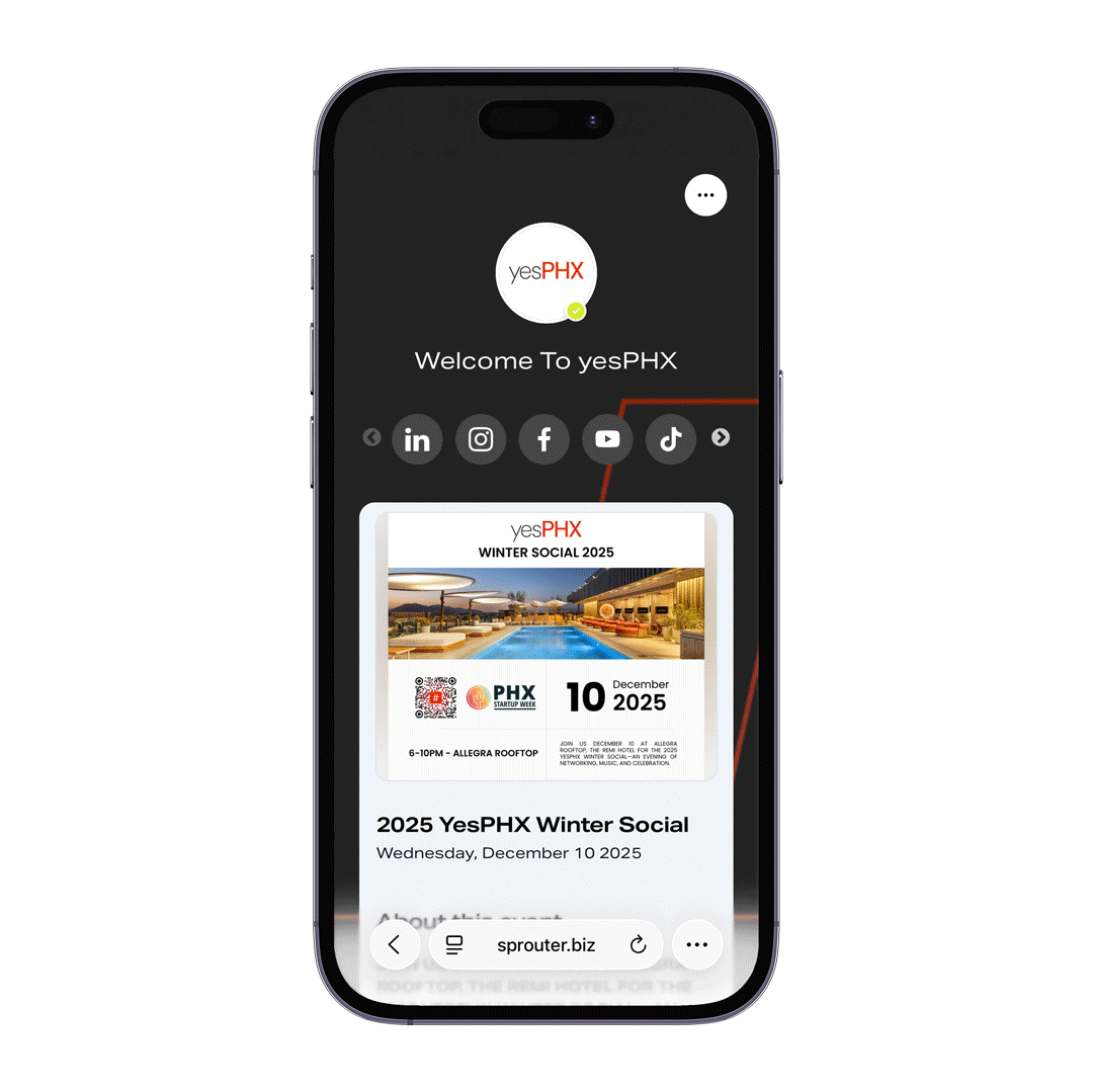
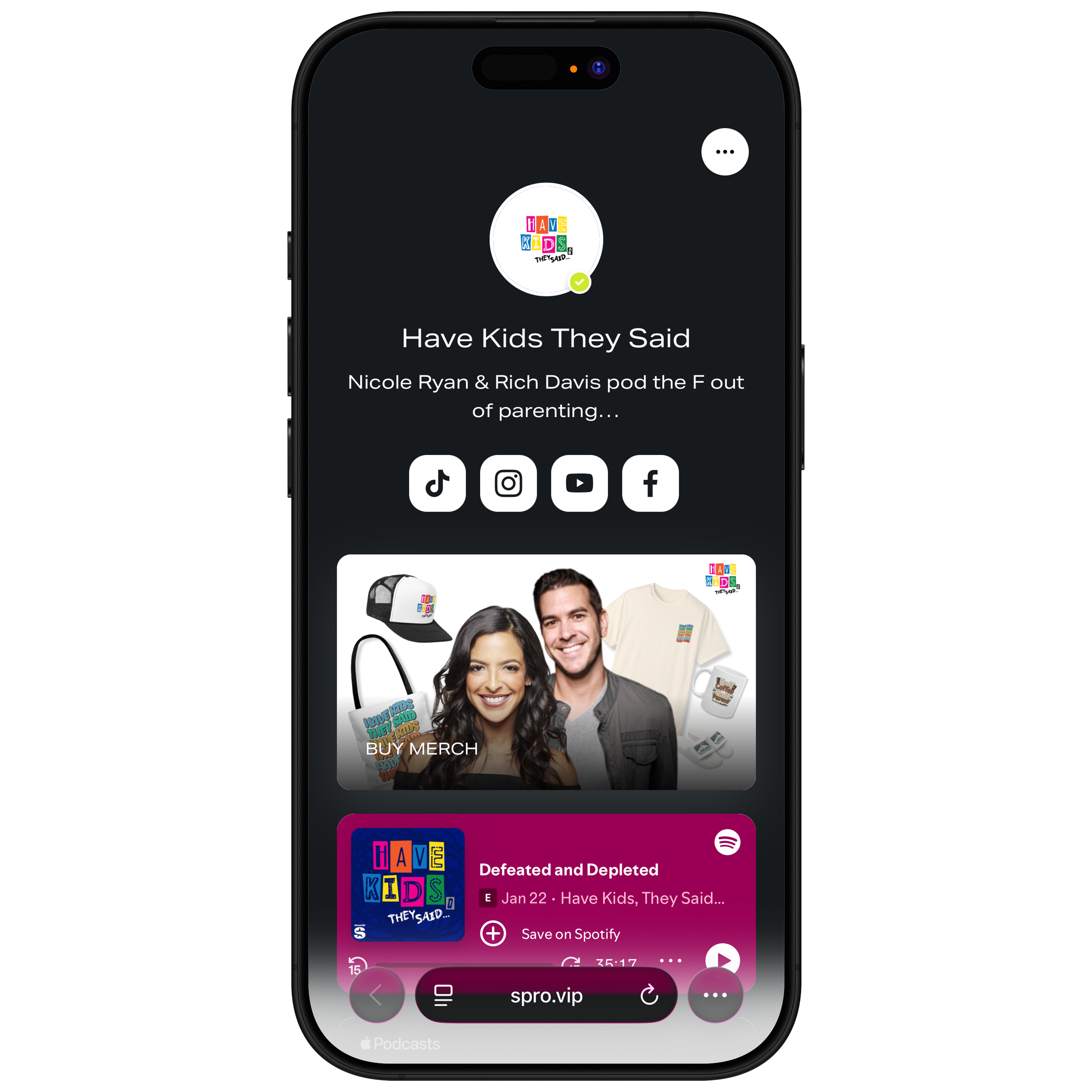
Connecting QR Codes to Landing Pages
QR code scans are inherently mobile interactions, making the connection between your codes and landing pages crucial. When someone scans a QR code from a poster, business card, or product label, they expect a seamless mobile experience.
Design dedicated landing pages for QR code campaigns rather than sending scans to your homepage. The landing page should deliver on whatever the QR code promised—a discount, information, exclusive content—immediately and without friction.
Platforms like Sprouter create mobile-optimized Action Pages designed specifically for this use case. The pages load quickly, display cleanly on any device, and enable immediate action—exactly what QR code scanners expect.
Bringing It Together
Creating high-converting mobile landing pages requires attention to speed, design, messaging, and ongoing optimization. The reward for this effort is substantial: capturing value from the majority of web traffic that now arrives on mobile devices.
Start by auditing your current pages for speed and mobile usability. Fix the fundamentals first—a fast, functional page outperforms a slow page regardless of other optimizations. Then refine your headlines, simplify your forms, strengthen your CTAs, and test continuously.
The businesses winning on mobile aren’t using secret tactics. They’re simply applying these principles systematically, testing rigorously, and improving incrementally. With the same approach, your landing pages can achieve the conversion rates that turn traffic into revenue.
Need mobile-optimized landing pages that convert? Sprouter’s Action Pages are built for mobile-first performance, integrating seamlessly with QR codes, event ticketing, and payment processing to create frictionless experiences for your audience.