
Every scan, tap, and click represents someone interested enough to take action. What happens next determines whether that interest converts to engagement—or evaporates entirely.
Action Pages serve as the critical bridge between initial curiosity and meaningful conversion. Whether visitors arrive from a QR code on product packaging, an NFC tap at an event, or a link in your social bio, the page they land on shapes everything that follows.
The average landing page converts at 6.6% across industries. But pages built with conversion principles in mind routinely achieve 10% or higher. The difference comes down to understanding what makes visitors take the next step—and eliminating everything that gets in their way.
The Single-Purpose Principle
The most common mistake on landing pages is trying to do too much. Every additional option, link, or distraction dilutes focus and reduces conversion rates. Research shows that pages with a single call-to-action boost clicks by up to 371% compared to pages with multiple competing options.
This doesn’t mean your Action Page can only contain one link. It means every element should support a primary conversion goal—whether that’s capturing email signups, driving ticket sales, booking appointments, or generating direct messages.
Ask yourself: if a visitor could only do one thing on this page, what would you want it to be? Make that action unmissable and friction-free.
Mobile-First Is Non-Negotiable
Over 62% of global website traffic now comes from mobile devices, and for Action Pages—which often receive traffic from QR codes and social links—that percentage runs even higher. Yet only 50% of landing pages are optimized for mobile users.
Mobile optimization means more than responsive design. It requires:
Touch-Friendly Interactions
Buttons should be at least 44 pixels tall—large enough to tap confidently without precision. Links placed too close together frustrate users and increase accidental taps.
Readable Without Zooming
Body text should be at least 16 pixels on mobile. Headlines should be legible at arm’s length. If visitors need to pinch and zoom to read your content, you’ve already lost them.
Fast Loading
53% of mobile users abandon sites that take longer than 3 seconds to load. Compress images, minimize scripts, and eliminate anything that doesn’t directly serve conversion goals. Every tenth of a second matters—0.1 second improvements in load time can increase conversions by 8-10%.
Thumb-Zone Design
The most comfortable tapping area on a phone is the lower-middle portion of the screen. Place primary CTAs where thumbs naturally rest rather than requiring reaches to the top of the viewport.
Above-the-Fold Essentials
Visitors decide within seconds whether to engage or bounce. The content visible without scrolling must accomplish three things immediately:
1. Establish Identity
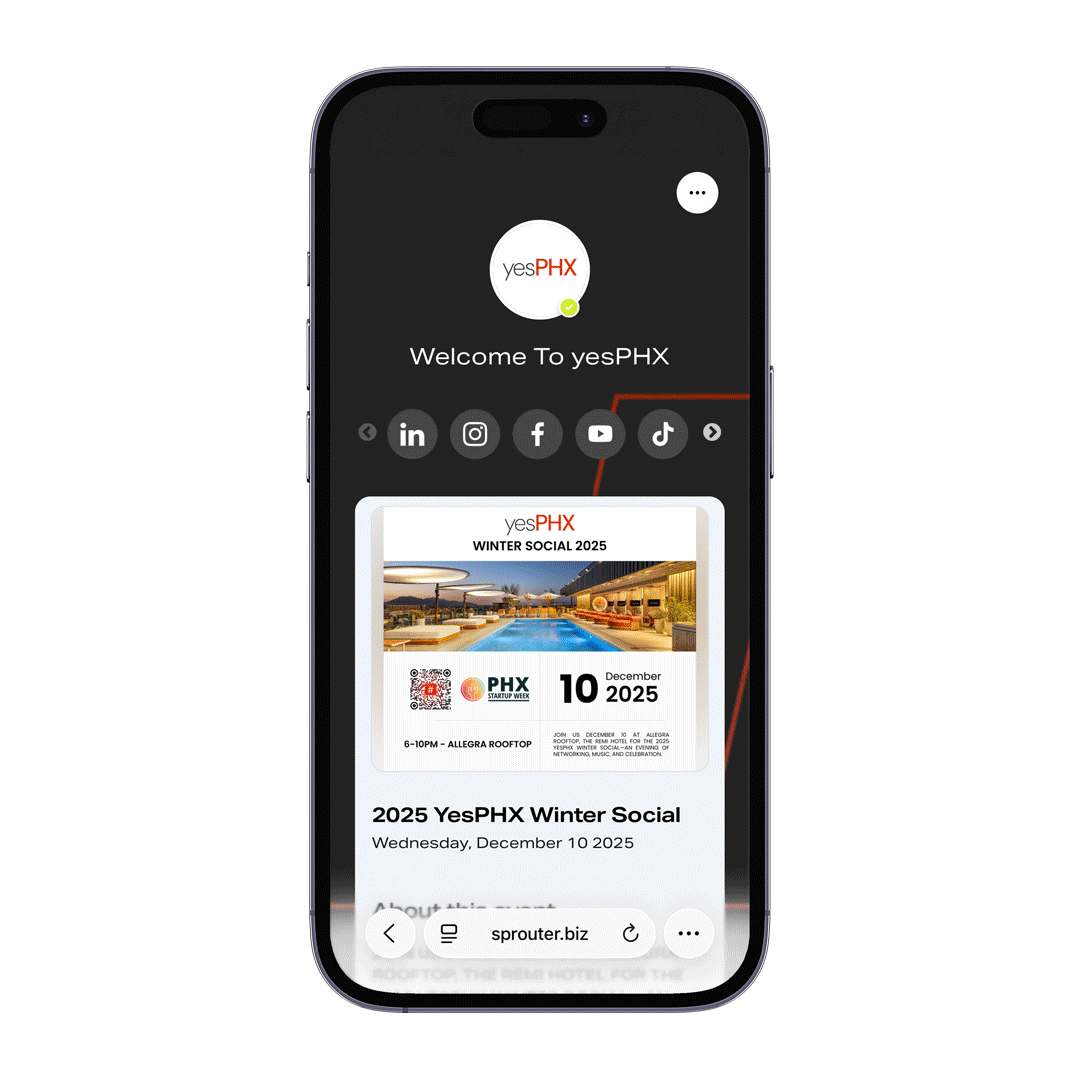
Your profile image, name, and bio should instantly communicate who you are and what you offer. On Sprouter Action Pages, this means a clear profile picture, a compelling headline, and a bio that answers “why should I care?” in 120 characters or fewer.
2. Communicate Value
What will visitors gain by engaging further? The benefit should be obvious before any scrolling occurs. Generic phrases like “welcome to my page” waste precious above-the-fold real estate.
3. Present Primary Action
Your most important CTA belongs where visitors can’t miss it. Whether that’s “Get My Free Guide,” “Book a Session,” or “Buy Tickets,” the primary action should be visible immediately upon page load.
Content Hierarchy That Converts
After establishing the above-the-fold foundation, organize remaining content to support the conversion journey:
Priority 1: Primary Conversion Mechanism
The main way visitors should convert—signup form, booking widget, purchase button—deserves prominent placement and design emphasis.
Priority 2: Supporting Information
Details that help visitors make decisions: social proof, key benefits, relevant credentials. This content answers objections and builds confidence.
Priority 3: Secondary Options
Alternative actions for visitors not ready for the primary conversion: follow on social, browse other offerings, download resources.
Priority 4: Navigation and Utility
Contact information, legal links, and other necessary but non-conversion elements can live at the bottom where they’re accessible without competing for attention.
The Psychology of High-Converting Pages
Understanding why people convert (or don’t) helps you build pages that work with human psychology rather than against it.
Social Proof Reduces Risk
Testimonials featured on 36% of top-performing landing pages aren’t decorative—they serve a psychological function. Seeing others succeed reduces perceived risk and validates the decision to engage.
For Action Pages, social proof can include follower counts, media mentions, client logos, or brief testimonials. Position proof elements near primary CTAs where they can influence decisions at the moment of commitment.
Scarcity and Urgency Drive Action
Loss aversion research shows that the pain of missing out feels twice as strong as the pleasure of gaining something equivalent. Limited-time offers, remaining inventory counts, and deadline-based urgency all leverage this psychological tendency.
Use these triggers honestly—manufactured scarcity erodes trust when exposed. But genuine urgency (event dates, limited availability, seasonal offers) deserves prominent communication.
Clear Expectations Reduce Friction
Visitors hesitate when they don’t know what happens next. Will clicking “Sign Up” trigger a long form? Does “Book Now” mean immediate payment? Will “Learn More” lead to more useful information or a sales pitch?
Set clear expectations: “Sign up in 30 seconds,” “Free 15-minute call,” “No credit card required.” Removing uncertainty removes friction.
Link Design and Organization
Action Pages typically contain multiple links, but not all links are created equal. Thoughtful design signals hierarchy and guides visitor attention:
Visual Emphasis
Primary actions deserve bold colors, larger sizes, or distinctive styling. Secondary links can use subtler treatments—outlines instead of fills, muted colors instead of brand primaries.
Strategic Ordering
The first link visible after the profile section gets disproportionate attention. Place your most important conversion mechanism there. With Sprouter’s drag-and-drop link ordering, you can easily test different arrangements to see what performs best.
Button Styling
Button shapes communicate personality. Sharp corners suggest precision and professionalism; rounded corners feel friendly and approachable. Match styling to your brand while ensuring all buttons remain clearly clickable.
Time-Based Visibility
Promotions, seasonal offers, and limited-time links shouldn’t clutter your page permanently. Scheduling features let you show links only during relevant periods without manual management.
Media That Enhances Rather Than Distracts
Images, videos, and embedded content can strengthen or weaken conversion depending on implementation:
Hero Images
Strong visual imagery establishes emotional tone and builds instant recognition. Weak stock photos feel generic and forgettable. If you can’t source compelling imagery, text-focused designs often outperform mediocre visuals.
Embedded Media
For creators and entertainers, embedding Spotify tracks, YouTube videos, or podcast episodes directly on Action Pages lets visitors experience your work without leaving. This builds connection and increases time-on-page—both valuable for conversion.
However, every embed adds load time and potential distraction. Use them purposefully when they directly support conversion goals, not as page filler.
File Downloads
PDFs, images, and documents available for download (supported on Sprouter with files up to 10MB) serve conversion goals when they provide genuine value—lead magnets, portfolios, menus, catalogs. Ensure file sizes don’t compromise page performance.
Testing and Iteration
Even well-designed pages benefit from ongoing optimization. The practices that work for one audience may underperform for another.
A/B Testing Fundamentals
Change one element at a time—headline, CTA text, button color, link order—and measure the impact on conversion rates. Statistical significance requires adequate sample sizes; don’t draw conclusions from handfuls of visitors.
Analytics-Informed Decisions
Which links get clicked most? When do visitors arrive? What devices do they use? Sprouter’s analytics provide these insights at various tier levels, from basic engagement metrics to granular tracking of every interaction.
Continuous Improvement
Landing page optimization isn’t a project with an endpoint—it’s an ongoing practice. Markets evolve, audiences change, and what converted yesterday may underperform tomorrow. Schedule regular reviews and remain willing to experiment.
Common Mistakes to Avoid
Too Many Options
Every link competes for attention. Ruthlessly cut anything that doesn’t serve conversion goals.
Slow Loading
Optimize images, minimize embeds, and test load times on actual mobile networks—not just fast WiFi connections.
Generic Copy
“Welcome to my page” wastes the most valuable real estate on your site. Lead with benefits, not greetings.
Missing Mobile Optimization
Test on actual devices, not just browser developer tools. Real-world mobile experience often differs from simulations.
Ignoring Analytics
Building pages without measuring performance means guessing at what works. Data-informed optimization consistently outperforms intuition.
Set-and-Forget Mentality
Pages that remain static while everything else changes inevitably underperform over time.
Putting It Together
High-converting Action Pages combine strategic design, psychological understanding, and continuous optimization. The fundamentals:
- Single primary goal that everything else supports
- Mobile-first design that loads fast and works with thumbs
- Above-the-fold essentials that establish identity, communicate value, and present action
- Clear content hierarchy that guides visitors toward conversion
- Analytics-informed iteration that improves performance over time
Sprouter’s Action Page builder provides the tools to implement these principles without technical complexity—profile customization, link management, media embedding, file hosting, and analytics across tiers. The platform handles infrastructure so you can focus on the creative and strategic work that drives conversions.
The difference between a 3% conversion rate and a 10% conversion rate might not sound dramatic, but consider the math: with 1,000 monthly visitors, that difference represents 70 additional conversions—70 more email subscribers, event tickets, or customer relationships—from the same traffic.
Small improvements in conversion rate compound into significant business impact. The Action Page receiving your traffic deserves the same strategic attention as the marketing driving visitors to it.
Ready to build Action Pages that convert? Start with Sprouter and create mobile-first pages with customizable links, media embeds, and conversion tracking built in.